Simpsons-like Paradoxes When Using Average Precision
November 12th, 2025 by Rohan Rao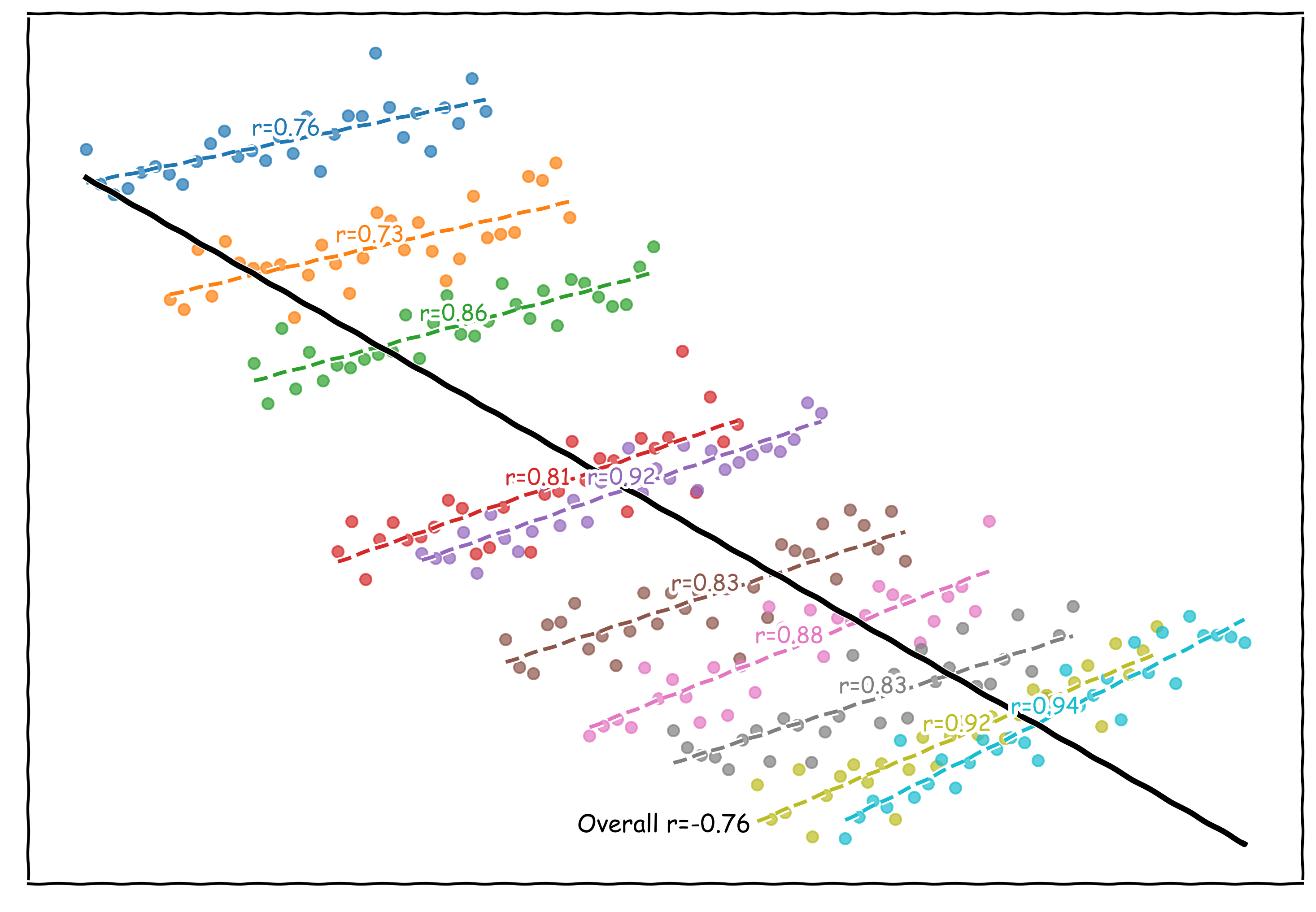
Simpsons-like Paradoxes when using Average Precision as a metric
Average precision (or AP, or mAP if averaging over multiple classes) is a commonly reported metric when evaluating classifiers or detectors (You’d be hard pressed to find a paper mentioning COCO without it reported). When evaluating an object detector over a dataset you might feel inclined to report the AP on subsets of the data along with the overall evaluation dataset
For example you might report the AP on your full dataset, and then the AP on small objects, and finally the AP on large objects (in fact this is default behavior for torchmetrics)
When doing this sort of decomposition with this metric I think there is some unintuitive behavior when thinking about performance on subsets of data and performance over the full dataset. I looked around on the internet (and asked some chatbots) and couldn’t find any documentation on this sort of thing so here’s mine
Average Precision
Average precision is a common evaluation metric for classification and detection models. I’ll provide a (probably overly) formal version of this metric.
Lets consider a dataset \(\mathbb{D}\)
and scoring model
\[s: \mathbb{D} \rightarrow [0, 1]\]which assigns a score to each element in \(\mathbb{D}\) and from this we can construct another function
\[m: \mathbb{D} \times [0,1] \rightarrow \{0, 1\}\]where \(m\) takes the score of a dataset element and then compares it to a threshold and returns a label of \(1\) if the score is higher than the threshold otherwise \(0\). We’ll call this threshold \(\alpha\)
lets also consider labels ground truth \(L: \mathbb{D} \rightarrow \{0,1\}\) which basically provides ground truth binary labels to our dataset examples.
Using this notation, at some threshold \(\alpha\) we can define some notion of True Positives (TP), False Positives (FP), True Negatives (TN), and True Positives (TP).
in table form here are how examples in \(\mathbb{D}\) are categorized in the following buckets (at a threshold \(\alpha\)) - I’ll try and keep colors consistent in all the below visualizations of this metric
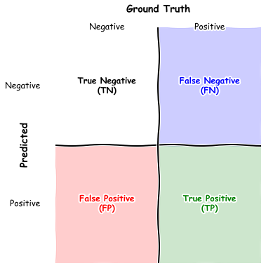
Informally evaluated on the dataset true positives are positive examples that the model labels as positive, true negatives are negative examples that the model classifies as negative, false positives are negative examples the model marks as positive and false negatives are positive examples the model marks as negative
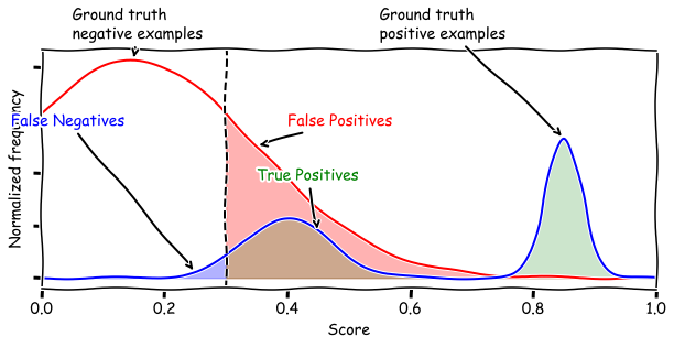
Now lets take a sample score function \(s\) and heres a plot of the score distribution over the dataset. The red curve indicates the distribution of the scores of ground truth negative examples (\(L(d) = 0\)) and the blue curve shows the scores of the ground truth positive examples (\(L(d) = 1\))
The vertical line shows a threshold value (and with that threshold the green shaded region indicates true positives, the red shaded region indicates false positives, and green shaded region indicates false negatives)
We care about these quantities because we construct two useful metrics of a score function as a function of threshold \(\alpha\).
Precision(α) can be thought of as the percentage of dataset elements that the model says is positive that are actually positive, and Recall(α) is the percentage of dataset elements that are positive that the model says are positive (all at threshold α).
Plotting the parametric curve of Precision vs Recall (with \(\alpha\) as the parameter). Precision and Recall generally trade off against each other (as we raise the threshold we get fewer FPs, but more FNs).
The area under the curve is called the Average Precision (AP). Mean Average Precision (mAP) involves averaging these values across multiple classes but we’ll consider the single class case for now
here’s an animation of constructing the PR curve and computing Average Precision
the curves with better AP generally have the scores for positive examples higher than the scores of negative examples
Simpson’s Paradox
The next thing we need to define is what Simpson’s Paradox is. A (in my opinion) reasonable way to characterize this paradox is that trends that might appear at the dataset level can reverse when you break the dataset into subgroups.
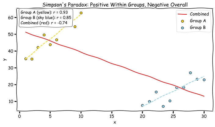
Here’s an example where within a group things are positively correlated but negative between groups
A Simpson’s Paradox for AP / mAP
Now we have all the info to establish a Simpson’s-like pardox for mAP/AP.
“Paradox” 1 - Partitions can both look better than the Aggregate
One aspect of a metric like accuracy (pct of correct labels guessed), is that if you have Group A, and Group B, with accuracies \(a_A, a_B\) and group sizes \(s_A, s_B\), the overall dataset accuracy \(a_O\) can be defined as
\[a_O = \frac{s_A}{s_A + s_B} a_A + \frac{s_B}{s_A + s_B} a_B\]since \(\frac{s_A}{s_A + s_B} > 0\) and \(\frac{s_B}{s_A + s_B} > 0\) and they sum to 1 the overall average is between the subgroup averages. This might let you find subsets where the model performs better or worse on the subset than on the overall data (and when we find a subset where it does better we know that the metric must look worse on the rest of the data)
This property doesn’t hold true when we compute AP on subgroups vs the whole datasets.
Here’s a really easy example:
In the two partitions we have great (almost perfect) AP - but in the overall dataset our AP is much lower
Here a main concept is the fact that the thresholds that do a good job separating the positive and negative example scores are very different between subgroups. When we vary the threshold parameter within a subgroup we’re able to increase precision at a high recall and then decrease recall at a high precision leading to a high AP, but those same thresholds that have good performance in subgroup A have bad performance in B (and vice versa). This means when we compute overall AP, at each threshold the PR point looks worse.
In a more handwavy sense the subgroups being able to independently vary their thresholds to compute AP leads to better looking performance than the overall evaluation (which is restricted to the same threshold value applying too both subgroups’ samples).
“Paradox” 2 - Models that score worse on partitions can still score better on the aggregate dataset
Here are two models on an aggregate dataset
In this case Model A has better AP on group A and B but in the overall dataset has worse AP.
In this scenario pushing the general mass of the score distribution of the positive examples to the right leads to an improvement in ‘overall’ AP but when looking at subgroups it can worsen the separation of positive and negative example scores within the subgroups (leading to worse per group AP).
This situation might look contrived but if we pretend that we have some reasonable subdistribution of data that has systematically lower scores or confidences (imagine day vs night images) then the above score shape could resemble that pattern.
Notably also these subgroups have the same size and same proportion (to differentiate them from simpsons like paradoxes that arise mostly due to class imbalances between subgroups)
Takeaway
Generally in statistics Simpson’s-like paradoxes always mean that interpreting results on subgroups or conditioned on latent variables need to be done with some care and AP analysis is no exception
We’ve constructed a few examples of “paradoxes” generally relying on the idea that having misalignment between good and bad thresholds between subgroups can lead to worse aggregate results than on the individual pieces.
This isn’t to say that breaking a dataset into subgroups to compute AP isn’t a useful thing to do, its more just a cautionary note when interpreting such analysis
Credits
The plotting package is the xkcd matplotlib package (and fonts from https://github.com/ipython/xkcd-font)